
Create Drag-and-Drop Product Grids
Step-by-step instructions for creating a Wunderkind product grid using Klaviyo's drag-and-drop editor.
Instead of using Wunderkind's standard product grids—which rely on Klaviyo's HTML blocks and require custom coding—this page presents an alternative designed for teams without dedicated technical resources. If configuring HTML/CSS isn't feasible, follow the drag-and-drop setup outlined below.
Begin your block in the Templates library
-
Go to the Templates page and click Create in the upper right.
-
Clear all default contents by selecting them and clicking the trash icon until only one Section remains.
-
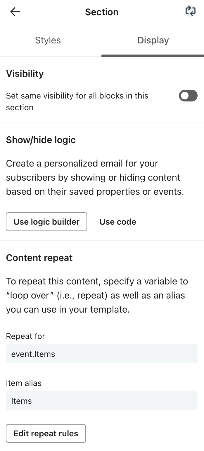
With the remaining Section selected, go the Display tab at the top of the settings panel and click Add content repeat. Here you will configure the block creative to repeat once for each product passed via the Wunderkind metric, enabling efficient iteration over all products within a single block.
- Repeat for:
event.Items - Item alias:
Items
- Repeat for:
-
After clicking Save, the cycle icon 🔄 will appear in the top corner of the settings panel, indicating that you've successfully added a Content repeat rule:
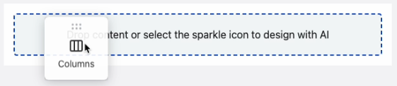
- Now you'll divide the Section into two columns, allowing each dynamic product's image and name to sit side-by-side. From the Content panel, drag a Columns block into the Section:
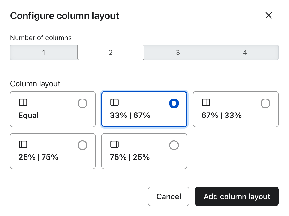
- In the Configure column layout modal, select 2 columns and split at 33%, 67%:
Design your block with dynamic elements
Now that you've set up a multi-column block to iterate over Wunderkind's products, it's time to start designing. Choose whether columns should stack in the mobile version of your grid, then expand the corresponding instructions.
The instructions below require you to add dynamic variables to your content. All variables referencing
{{Items...}}will populate based on the Content repeat settings set in the section above. As you move through the steps, feel free to brand and style your product grid as needed.
Columns maintain on mobile
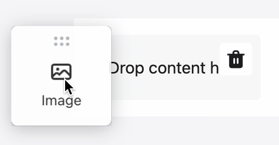
- From the Content panel, drag an Image block into the left column.
-
- In the image settings panel, click Select image > Dynamic image.
- Input
{{Items.WkImageUrl}}and save. - Set Alt Text to
{{Items.WkCopy}}. - Set Link address to
{{Items.WkUrl}}.
-
- From the Content panel, drag a Text block into the right column.
-

- In the Styles tab of the text block's settings panel, enable the Full width on mobile toggle.
- Drop down the Source code option, paste the below code, and click Apply:
-
<a href="{{Items.WkUrl}}" style="color:#000000;font-size:15px;font-family:sans-serif;text-decoration:none;" target="_blank">{{Items.WkCopy}}</a>🎨 See Klaviyo's guide for best practices on styling text in emails.
- From the Content panel, drag a Button block beneath the Text block.
-
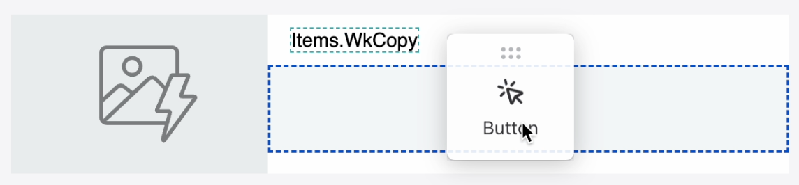
- Set Link address to
{{Items.WkUrl}}and align left in the Style section.
-
- Re-select the entire Section and add final touches in Styles tab:
- Set Column content alignment to center.
- Under Mobile stacking, select "No stacking".
Columns stack on mobile
- From the Content panel, drag an Image block into the left column.
-
- In the image settings panel, click Select image > Dynamic image.
- Input
{{Items.WkImageUrl}}and save. - Set Alt Text to
{{Items.WkCopy}}. - Set Link address to
{{Items.WkUrl}}. - Un-toggle Fill column.
-
- From the Content panel, drag a Text block into the right column.
-
- In the Styles tab of the text block's settings panel, drop down the Source code option. Paste the below code, and click Apply:
-
<div style="text-align:center;"><a href="{{Items.WkUrl}}" style="color:#000000;font-size:15px;font-family:sans-serif;text-decoration:none;" target="_blank">{{Items.WkCopy}}</a></div>🎨 See Klaviyo's guide for best practices on styling text in emails.
- From the Content panel, drag a Button block beneath the Text block.
-
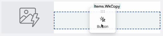
- Set Link address to
{{Items.WkUrl}}.
-
- Re-select the entire Section. In the Styles tab, set Column content alignment to center.
Preview your block with sample products
In order to visually preview your block against sample product payloads, Wunderkind API metrics must already exist under Analytics > Metrics.
- In the Template editor, click Preview & test in the top right corner. This will bring you into Preview mode.
- In the right panel, under Preview data source, switch to the Event tab, and select one of the
wkndmetrics.- Note: Once your Signals flows are created, you can similarly preview emails within the flow against profiles associated to the trigger metric. See instructions here.
- Check visual rendering across desktop and mobile, then exit Preview mode.
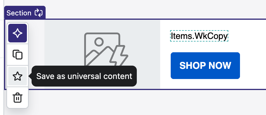
Finalize your block as Universal content
- In the Template editor, select the Section and use the star icon to save your block as Universal content.
-
- Exit the Template editor.
- Go to Content > Universal content to see your new block, which can be used globally throughout your Signals flows. To note, deleting the Template at this point will keep the Universal content block intact.
Updated 4 days ago